Now, I'm conceptual and linguistic but not particularly visual so I know that this is one of those cases where I need to trust Chris, our designer, to come up with something excellent.
But I surprised myself with how difficult that was. Logos are something that everyone has an opinion about.
So I started thinking about what makes a good logo and looking, closely, at other people's logos.
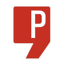
One of the best logos I think I've seen recently is for Creative Protege. Apart from the fact that I love what these guys are doing to get fresh new design talent exposed, I think the CP logo is strong, distinctive and makes excellent graphic use of type. I can't help it - even when it comes to graphics I lean towards punctuation, typography, letters and words.
Of course, looking at some of the biggest and best is also useful for understanding what works and Logo Design Love's wonderfully simple logo designs page is a pretty good place to start. And if you're thinking about a logo refresh you can learn a lot from their 10 successful logo redesigns page too. In fact, just look at their whole website.
So what have I learnt?
- it has to be simple
- it has to be recognisable
- it can't possibly reflect everything you are or do
- it should be clever, but not too clever
- it has to say something - one thing - about you
- it has to do it in a way that will reproduce well online, in print, large, small, colour, black and white, and no matter what the quality of the print or materials
- it has to be bold, beautiful, and practical.


No comments:
Post a Comment